2015-08-12
 1145
1145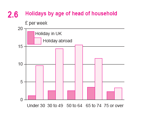
a) Answer the following questions:
1. Which group spends least on holidays in the UK?
2. Which group spends most on holidays in the UK?
3. Which group spends most on holidays abroad?
4. Which group spends least on holidays abroad?
b) Describe the chart that shows spending in pounds per week by age on holidays in the UK and holidays abroad (in other countries).
Task 5. Mobile Phones and Landlines
The chart shows the number of mobile phones and landlines per 100 people in selected countries.
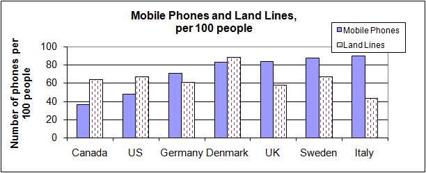
Fill in the gaps in the description of the graph:
| conclusion | contrast | Denmark | fewer | higher | hundred | pattern | seems |
| selected | slightly | than | twice | unusual | USA | use | users |
The graph shows the number of mobile phones and landlines per 100 users, for __________countries.
The biggest __________of mobile phones are the Italians, with 88 mobile phones per 100 people.
Overall, most of the countries included in the graph have more mobile phones ___________landlines.
For example, Italy has _____________as many mobile phones as landlines, with 90 mobiles per ______________ people compared to 45 for landlines.
However, in some countries, the number of landlines is_________________.
One example is the_________________, where the number of mobiles, at 50 per 100 people, is much lower than the number of landlines, at almost 70 per hundred.
A similar ______________ can be seen in Canada.
Mobile phone ___________ is low in Canada, with _______________than 40 phones per 100 people.
The highest number of landlines in the graph is in_________________, with about 90 per 100 people.
In_______________, the lowest figures for landlines are in Italy and the UK.
Denmark is also ________________ because it has _______________ more landlines than mobile phones.
In_______________, it __________that mobile phone use is higher in Europe than in North America.
b) Describe the chart displaying the number of mobile phones and landlines per 100 people in selected countries.
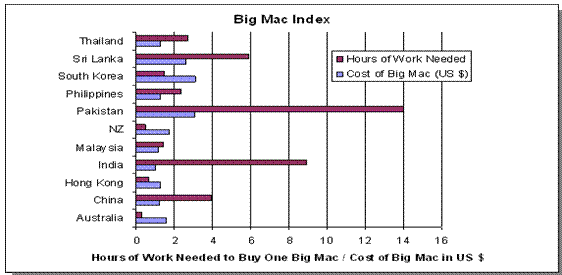
Task 6. Big Mac Price and Salary Comparison
If you are a cleaner in McDonalds in the countries below, how long do you have to work before you can afford to buy a Big Mac?
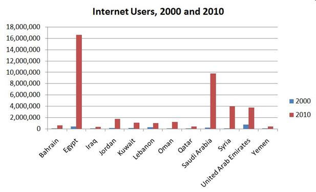
Task 7. Internet Users in the Middle East, 2000-2010
Describe the graph that shows changes in the Internet use in selected Middle Eastern countries between 2000 and 2010.
Line Graphs
Line graphs are used to show a trend or pattern which usually takes place over a period of time. It is important to look at the overall pattern on a line graph as well as the significant features within it.
For example,
It shows the population of 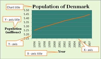 Denmark from 1996 to 2007. You can see that in 1996 the population was 5.25 million and that by the year 2007 it had grown to 5.45 million.
When you write about a line chart it is important to look first at the Chart Title. This tells you what information the graph displays and you can use this information in your description.
Then look at the X and Y axes. The titles of these axes sometimes give you information you can use in your description. It is important also to look at the UNITS. On the Y-axis in this graph the units are millions. The population of Denmark in 1996 was not 5.25, but 5.25 million people.
Line graphs describe change. When describing these graphs you must answer the question, "What changed?". In this case we can see that the population of Denmark increased from 1996 to 2007.
We can also ask the question, "How did the population change?". Because the line is fairly smooth, we can say that the population increased steadily.
Lastly, we can ask the question, "How much?". In this case, "How big was the change in population?" The population in 1996 was 5.25 million and in 2007 it was 2.45 million. So there was an increase of 0.2 million or 200,000 people.
To provide a good description of the graph, it is necessary to answer the following questions:
1. What exactly does the graph show? (Use the chart title to help you answer this question)
2. What are the axes and what are the units?
3. What changed?
4. How much did it change?
“This graph shows population change in Denmark from 1996 to 2007. Denmark's population grew steadily from 5.25 million in 1996 to 5.45 million in 2007, an increase of 200,000 people.”